Web design
Our aim is to create an engaging online experience. First impressions count when visiting a website. This is the shop window to your brand, service offering or online shop... and so when visitors land, you will want to maximise this experience. We plan, explore & create an exciting journey to capture your audience.
The website design and user experience are equally as important as the functional build. Where and how your main offering is displayed and taking your visitors on an interactive journey takes plenty of planning and expertise before the code even starts. Your website is your shop window to the world after all, so there should be no compromise when planning and crafting your online experience.
Contact us today:

Pushing the boundaries
Website design is one of many parts of the process that are required for creating a truly immersive online experience. The web design process is extremely important to get right from the outset, as it’s proven that visitors drop off if they find the website unappealing or unattractive. You will be involved throughout the creative process and liaise with us until the designs are completed and approved.
The initial process is to understand the purpose of the website, to understand your target audience and run through the functionality you require. We will plan the site structure and if required create a technical specification document, which the developers will adhere to when the designs are approved. This means everyone knows what is expected throughout.
After the creative process is complete, the development phase is started, and this is when you get to see the designs come to life online. Depending on your build this may include Front-end, Backend and eCommerce development. Eventually when everything is complete and approved, it is launch day. With the technical expertise at Codeheroes, we can offer full support moving forward, so you are always in good hands.
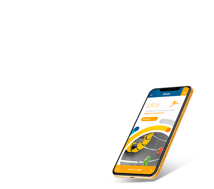
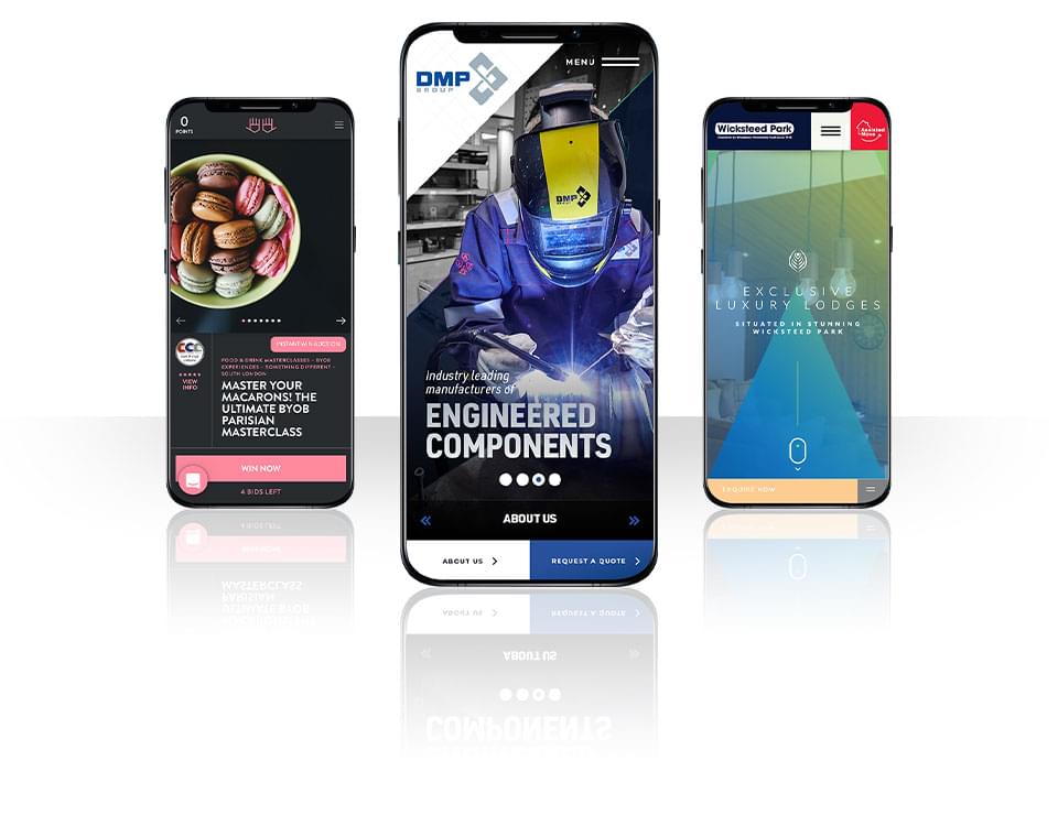
Responsive Design & Development
Superfast responsive sites, to ensure you look good on mobile through to desktop
All our builds include responsive development. This means the website will be optimised for smartphone mobile devices, through to tablet and up to desktop screens. We develop with 'Progressive Advancement', meaning the website is optimised for mobile devices first, then adapt the website to tablet devices and then desktop screens.
Web browsers prefer websites to be optimised for mobile devices first and so developing in this way will help with your rankings on Google.

